Ready to pick up where I left off
By Al R. Young
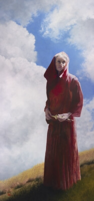 |
| Under Whose Wings Thou Art Come to Trust by Al R. Young |
dimensions (unframed width x height)
35 3/8 in. x 76 7/16 in.
support
Panel
milestones
Research begins — 2003 January
Composition begins — 2012 August
Brushwork begins — 2013 December
Painting completed — 2014 May
equipment
Creating a painting often involves creating or modifying tools or making improvements to the studio itself.
Installing a scrim
Simplifying mounting of tray and trestle for the $10 easel
Simplifying mounting of panel clamps
Making a tree-limb brush holder
Enlarging the clamp-on mahl stick
methodology
This section presents only one or two items that may be of interest to professional artists, amateurs, and others interested in the work of the Studios.
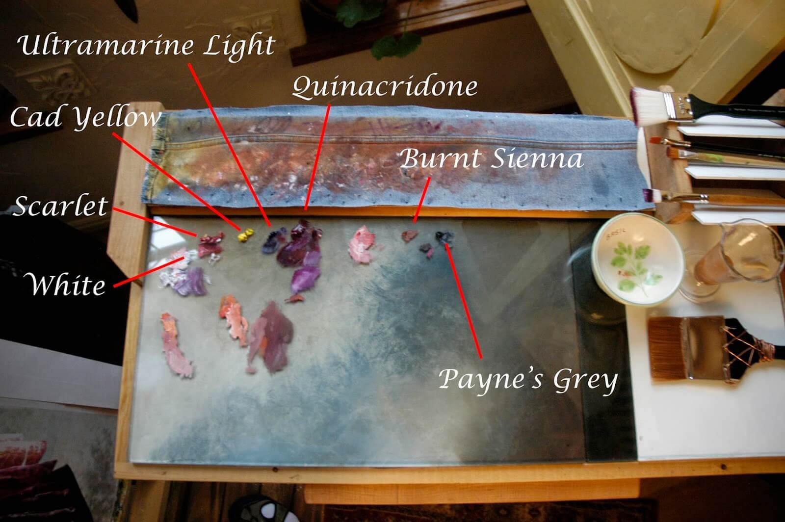
During painting projects like this, that sometimes stretch across years, I occasionally photograph my palette, after a painting session, to record crucial color detail so I can more readily pick up where I left off. And sometimes, instead, I rely solely on my color formula notes. Such notes are easy when planning colors for a painting project, but in the flurry of color-mixing on the fly during an intensive painting session, I find that photographing the palette taboret and maaking cryptic notes is best because there is a certain rhythm (not unlike a dance) involved in color mixing and matching, and to break the rhythm by trying to document everything that leads to particular colors and glazes can break the muse.
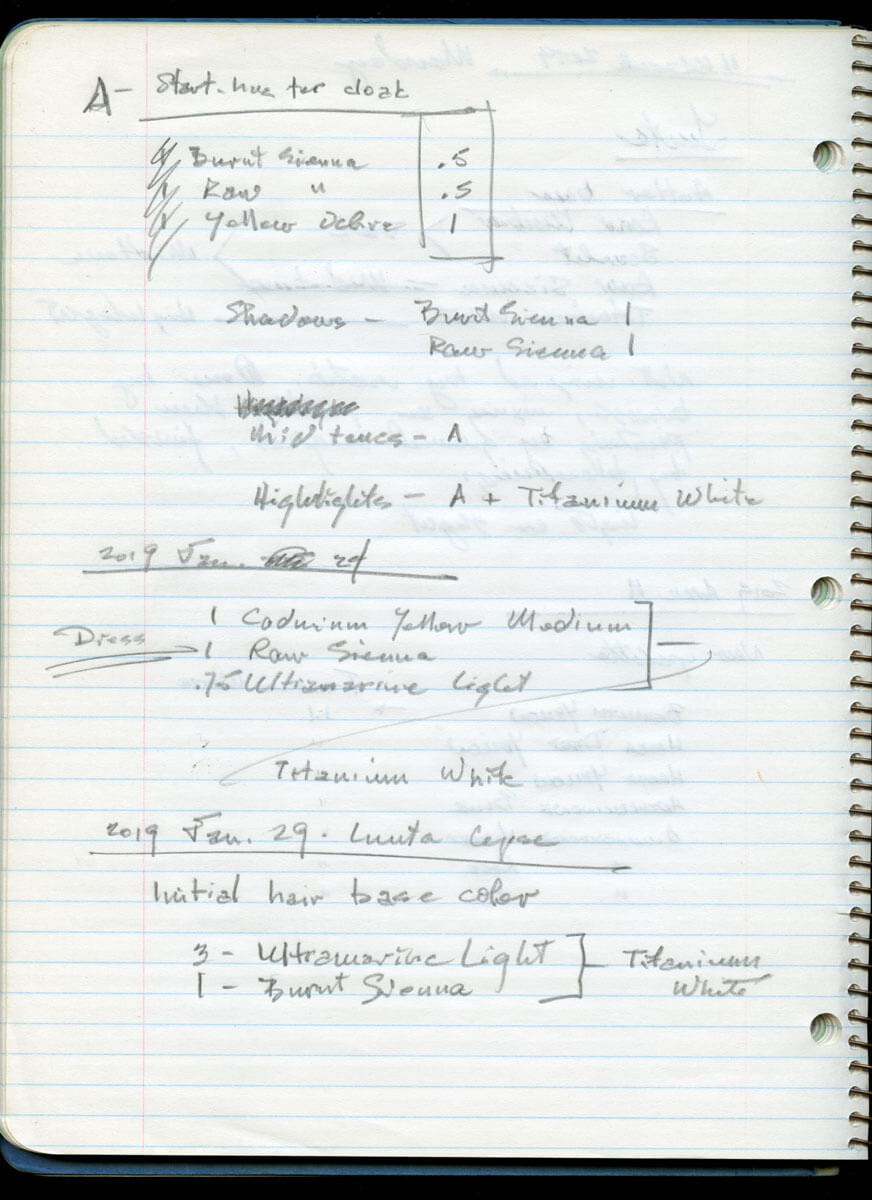 |
| Notes from my spiral studio journal in which I can jot down formulas, however cryptically, without breaking the muse. |
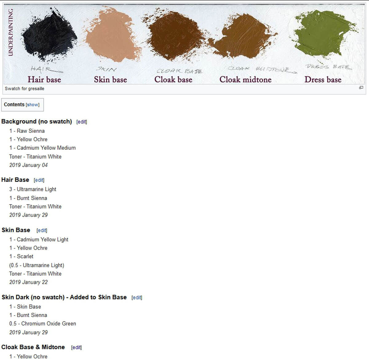 |
| Color notes from a project journal, featuring labeled color swatches for an under-painting and the proportion-formulas from which the swatches derive. |
When I started painting, I tried everything I could think of to ensure that the paint I mixed in one session would last across as many sessions as possible, in case I discovered that I wasn't finished using it after all. I wrapped unused paint in plastic. I tried wrapping it in aluminum foil. I tried empty make-up jars. I tried empty tubes from art-supply outlets. Eventually, several things happened: I got to where I could mix-to-match and my idea of matching changed because I eventually realized that color in nature—color as any light washes over it—isn't uniform anyway. What appears to be a single or solid color is simply a perceptual average. Consequently, the idea of precision in matching ceased to be machine-like or laboratory-like and became natural, as in Nature.
Many years ago a client wanted a room we were remodeling painted yellow because Claude Monet's dining room was yellow. We painted the room accordingly and the client didn't like it because the yellow in those places along the seams between ceiling and wall were a darker yellow than the color of the walls on which the sun shone fully. The client wanted the room re-painted in white, which we did, with the result that the white was slightly darker in the same places and in the same way that the yellow had been darker; nevertheless, the client didn't mind because, truth to tell, having a yellow room in the public part of the house was outside the client's comfort zone, notwithstanding the expressed desire to have a room like Monet's kitchen. The result was that the client was happy with the white room and content with only dreaming about or visiting Monet's kitchen. Part of the point, here, is that color is always about emotion and courage.
One of the realities about color is that only in laboratories and clinical discussions of light and color-theory do colors exist in an abstract concept of purity. The sky, for example,is all kinds of blue, and not mixed (at least not on the same visual plain), but layered or filtered by the colors of atmospheric and other conditions between the atmospheere and us. Color depth, as I choose to use the term here, is not saturation or intensity of hue, but the vector between the viewer and the translucent glaze layers stacked perpendicularly to the line of sight, layers whose colors mix more or less vertically on the panel where the glaze layers reside. (The colors of such glaze layers are juxtaposed and therefore mix because they are adjacent, but not on the same horizontal plain as is the case with two color fields side by side in the kinds of experiments featured in the works of Goehte, Itten, and others.) I soon lost track of the times I just knew I had arrived at the exact match I wanted, only to discover that the dollop on the end of my palette knife turned into a very dense, very flat, very tactially sterile painted-wall when I applied the color to a large enough area. The skies I wound up painting with a particular mixture weren't right, but not because I hadn't matched the color of the sky I kept looking at. It wasn't right because I needed atmospherics, and, for me, translucent glazes provided the atmoshpherics. Furthermore, the phenomnea of atmospherics is not limited to the earth's atmosphere, but is present in all natural manifestations of color. To paint color is to paint what light does with color. The paint in the tubes is only part of the task. Indeed, mixing the paints is only part of the task. For me, the task involves glazes as well as the mark-making involved in the way the paint is applied, for it is in the glazing and the mark-making that the behavior of light with respect to color is more completely expressed. Then, of course, there's the matter of what light does with the painting (or representation), but that's another story.
The colors we think we see and the names by which we see them, are unknown to the colors themselves. (Deep in the architecture of existence there is probably something at the heart of color and its perception, that is—or is like—the eye and the mind and the colors themselves all seeing or thinking or speaking in the same terms.) But, from a practical standpoint, replicating color is only important to an artist as the artist may decide replication is important, and even then the same principles apply to an artist's use of color that apply to a writer's work of literature; which is that the work or representation or rendering must be coherent within itself. (In this sense, every artwork is tonal.) It isn't necessary to know all about color or all about light or all about the eye or the mind before stepping into the namesless infinity of color. The more we do know about these things the better, particularly if we don't lose heart in the midst of trying and learning (which is, ultimately, to also find out more and more about how much we really do not know). We need to know enough to be able to express whatever it is that is required by a particular project and we need the courage to risk making mistakes.
Tags: Under Whose Wings Thou Art Come To Trust, 2019, Color, Project commentaries, Tips and techniques, Women of the Bible Art Collection
Browse articles by year: 2026 . 2025 . 2024 . 2023 . 2022 . 2021 . 2020 . 2019 . 2018 . 2017 . 2016 . 2015 . 2014 . 2013 . 2012 . 2011 . 2010 . 2009 . 2008 . 2007 . 2006 . 2005 . 2004 . 2003 . 2002 . 2001 . 2000 . 1999 . 1998 . 1997 . 1996
Browse articles by topic: Art lessons . BenHaven Archives . Blank art diaries . Fine art photography . Framing . Illustration . Inspiration and creativity . Isles of Rune . Limited Editions Collection . My Fathers Captivity . News . Novellas . Oil paintings and prints . Operations announcements . Orders and shipping . Overview . Portfolios . The Papers of Seymore Wainscott . Project commentaries . Recipes by Nancy Young . Recommended reading . Recommended viewing . Temple artworks . The Storybook Home Journal . Tips and techniques . Tools supplies and operations
Browse articles by topic: Art lessons . BenHaven Archives . Blank art diaries . Fine art photography . Framing . Illustration . Inspiration and creativity . Isles of Rune . Limited Editions Collection . My Fathers Captivity . News . Novellas . Oil paintings and prints . Operations announcements . Orders and shipping . Overview . Portfolios . The Papers of Seymore Wainscott . Project commentaries . Recipes by Nancy Young . Recommended reading . Recommended viewing . Temple artworks . The Storybook Home Journal . Tips and techniques . Tools supplies and operations